As a geographer and a cartographer, I wanted to focus on the cultural aspects of different geographical locations in relation to infant health. The question I had at hand was which countries would be the worst for me to start and maintain a family with children so that I could avoid them. I love the United States but I wanted to try something different and my personal goal has always been to live in beautiful Ethiopia because I had an apartment in the Little Ethiopian District of Los Angeles and I felt that the culture was vividly rich and the food was beyond delicious. This project was a goal to determine whether or not Ethiopia would be a suitable or viable location to start my family. I was thinking of factors that would lead to a proper health care system for my children to be born into, as well as a location that would provide equal opportunities for my newly established family. I decided to look at the most up-to-date GINI and Infant Mortality Rates because I wanted to find the worst locations for child bearing. This can be useful for individuals that plan on moving to another country to start a family because they can see which country is most suitable for their child- bearing needs. This GIS vector spatial analysis adds value to the given information and to my topic of choice because it can provide the suitability output with two crucial factors. In analyzing the information at hand, I am able to create a map that will provide suitability rankings of different countries in the world and can broaden my perspective on which countries I would want to avoid moving to.


Methods
To begin the creation of the suitability map, data acquisition from CIA.gov was needed for the Infant Mortality Rates and Nation Master.com provided the most up-to-date GINI index of the world’s countries. I chose the GINI index and its corresponding coefficients since it was a good indicator for distribution of income or wealth within a country. The GINI index incorporated many factors that have “found application in the study of inequalities in disciplines as diverse as sociology, economics, health science, ecology, chemistry and engineering.” (Wikipedia.org) It has found many uses because it is a good indicator on how well the infrastructure is in that given country. The Infant Mortality Rate (IMR) was used because this can give me a good indication of whether or not the country has a hospitable, safe and clean environment for children to be born in. The Microsoft Excel program was used to sort the data and then afterwards, a DBF could be created in ArcCatalog for the transfer into ArcGIS. With the Excel program, the fields of Infant Morality Rates and GINI index were able to be on the same spread sheet. The data from the excel spread sheet was used to create a join with the attribute table of the world shape file. Afterwards, I opened the attribute table in ArcGIS to add a new field. This new field would become the new map of suitability and to calculate this, the equation (INFANT MORTALITY RATE x .6 + GINI Index X .4) was used. The given weighted variables for IMR and GINI were concluded by examining how the IMR is more important in this suitability map because our main concern is to determine the worst location for child birth and not solely concerned with inequality. Although the GINI index field is very vital since it is a main factor that leads to the emergence of a low or high IMR, it should be noted that the IMR focuses more directly to the topic question and map theme at hand. Infant Mortality Rates was given an arbitrary value of .6 while the GINI was given .40. One field was given more weight than the other due to research that shows that although GINI coefficient reflect inequality ratings of a country and can be directly related to the Infant Mortality Rates, ultimately the Infant Mortality Rates are more precise in the final suitability map that determines the worst places for child-bearing.
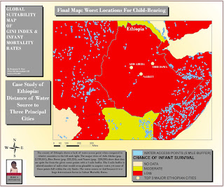
After the suitability map with the two factors of GINI and IMR were created, I wanted to focus more in-depth on the country of Ethiopia as a case study. This will help me in determining why Ethiopia was ranked in certain position on the final suitability map and this needed data acquisition from UCLA GIS database for water sources. The factor of water sources is vital in influencing IMR because one of the main causes of infant death is the lack of water. “Traditionally, the most common cause worldwide was dehydration” and with the given water point data, a 5 mile buffer can be created using the buffer tool in the Arc Toolbox in ArcGIS to see how accessible water is in three major cities in Ethiopia.
Results
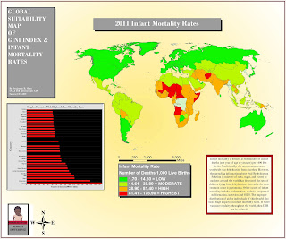
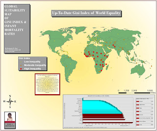
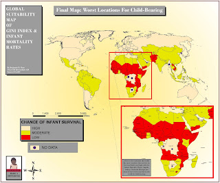
The maps support the research and display values that logically correlate with each other. The IMR Map reported that the countries within the continent of Africa and the country of Afghanistan had the highest infant mortality rates. The high number of Infant deaths for these top tier IMR countries ranged from 81.41 to 175.90 infant deaths per 1000 live births. The GINI index map reported similar results with the focal point on many African countries falling in the “High Inequality” bracket. Afghanistan also fell within this range. It was rather interesting that Africa had such a high concentration of infant deaths and inequality. It led me to believe my assumption that the lack of equality within a country will result in the lack of resources for infants. The Final Suitability Map was the final output needed to determine which location were bad options for child-bearing. I have realized that the country of Ethiopia would be one of the worst places in the world for child-bearing and I would have to re evaluate my decision on moving there.
Further research on the factors of IMR will show that dehydration was a main cause and a creation of a buffer map of the three major cities in Ethiopia to show their proximity to the water point data would be useful. Looking at Ethiopia itself, it is clear that the country does not have as much access to water as seen by the data acquired for UCLA GIS database. The distance of the water sources were far from the top three major cities leading me to believe that the lack of hydration is a huge problem in the country.
Before reaching my results, there were problems that I had encountered such as the fact that not all countries had accurate information such as: Congo, Democratic Republic of Congo, Botswana, North Korea, United Arab Emirates, and Myanmar. This inaccuracy and lack of information can be due to the lack of infrastructure in the country. The lack of infrastructure would result in the absence of a lot of census information or vital statistics making it hard to acquire all the necessary data. I conclude that some of the more developed countries such as North Korea may not have a lack of infrastructure but rather they would not want their information leaked. Another problem was experienced due to the attempted joins of the excel sheet and the country field on the shape file. I had to cross check all the names to make sure that they were in the proper spelling so that they could be compatible to join. If there was any error in the name, the information would not show up correctly on the map output. This was a tedious task since there were so many countries that needed to be checked and edited.
Conclusion/ Discussion
Looking at the map, most of the countries with the worst ranking for child-bearing are in Africa and this can be due to the low Infant Mortality Rate and the high inequality shown in the GINI index. Another map with the focus on Ethiopia was made in order to show how the vast proximity of major cities to water access plays a role in creating a higher IMR. Water is a very essential factor needed for the survival of young infants and even though the major cities are far from the water sources, there should be some type of infrastructure that can make the process of obtaining water easier. Unfortunately for Ethiopia, they also have high inequality as shown by the GINI index map, which would lead one to assume that the distribution of wealth, income and basic necessities is not fair. The question that I had at hand about analyzing whether or not Ethiopia would be a suitable and safe place for my personal child bearing has proven to be an obvious one. The country of Ethiopia is definitely not a suitable place for child-bearing. The neighboring countries of Kenya and Eritrea are better options and as shown to be more suitable by the final suitability map. It is rather unfortunate that the country of Ethiopia falls into that ranking and would not seem like the best suitable place to start and grow a family in, but I am glad that I was able to produce a suitability map so that I could analyze the country and make a knowledgeable decision.
Sources
http://www.cdc.gov/omhd/amh/factsheets/infant.htm
http://www.dcp2.org/file/66/Disease%20and%20Mortality%20in%20SSA.pdf
CIA.gov
Nationmaster.com
http://en.wikipedia.org/wiki/Infant_mortality
http://en.wikipedia.org/wiki/Gini_coefficient
http://gis.ats.ucla.edu/mapshare/
No comments:
Post a Comment